See Inside Snark Park, Snarkitecture’s Art-Themed Amusement Park
Written by SOURCE on March 16, 2019
Daniel Arsham, Alex Mustonen, and Benjamin Porto, the partners behind design studio Snarkitecture, have developed a specific identity with their slick, minimal spaces and objects that confuse and entice the senses. But they’ve never been in complete control of how their work is presented—until now.
Arsham, Mustonen, and Porto are usually showing their designs in someone else’s museum or gallery, and collaborating with clients including Beats, Kith, and Usher, but with Snark Park, their new interactive space, they had final say over everything.
“Based on the amount of people that we had to go through on some of our previous installations, we saw this opportunity to create a space that would be ours in its entirety and we could control everything,” said Arsham. “We’ve designed permanent projects for many other clients, but we’ve really never designed one for ourselves.”
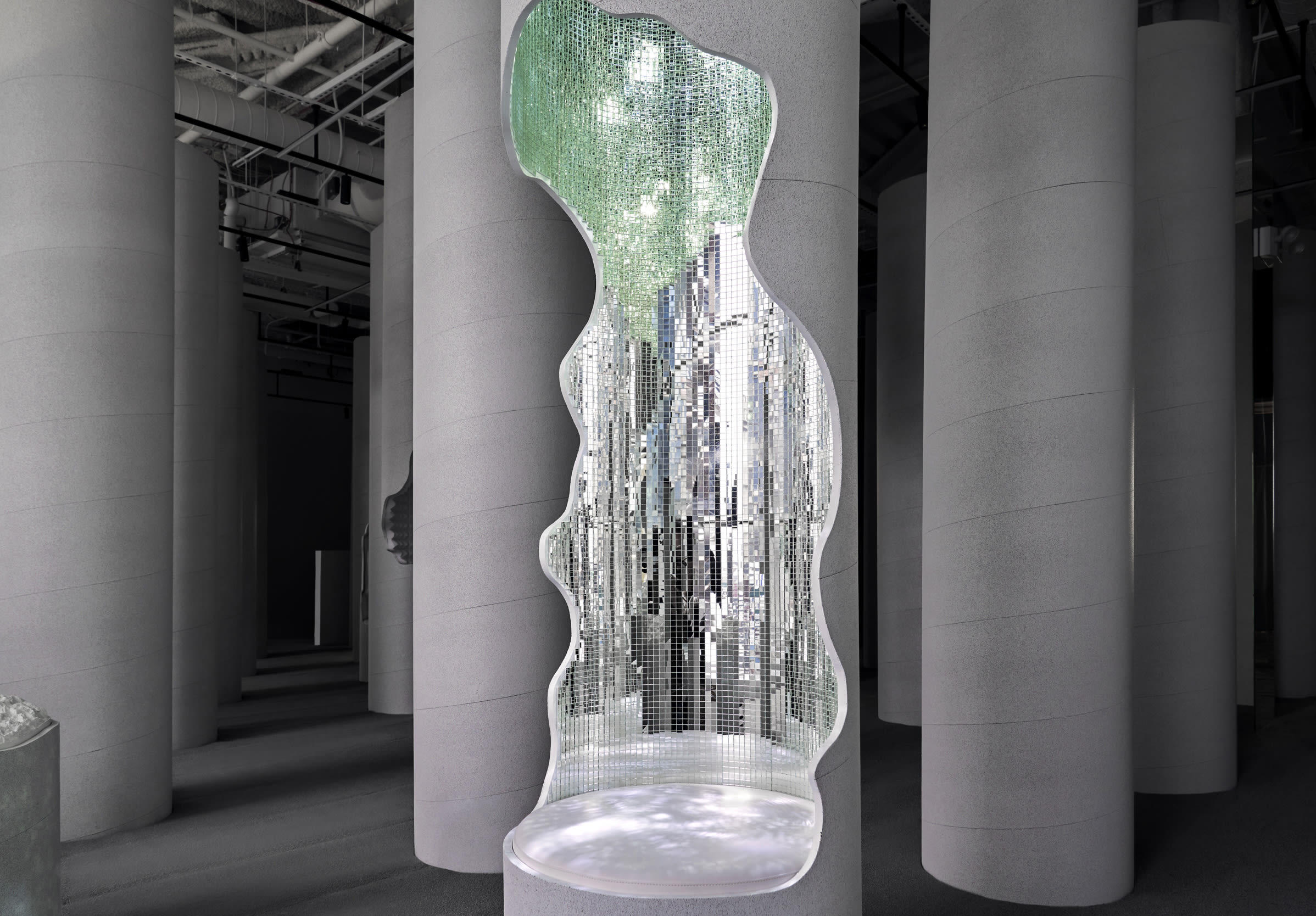
Located at Hudson Yards, a mall that just opened in New York City, Snark Park, which will change every few months, debuts with Lost and Found, an exhibit that takes visitors through a monochromatic space that welcomes attendees to touch and interact with the art—there’s also a Kith Treats at the entrance. Here, the three partners discuss what it’s like to work together, the exclusive merch, and what’s next for Arsham’s partnership with Adidas.
So talk about the projects you’ve worked on before, and how it evolved to this. Why do you think your aesthetic stands out?
Arsham: Snarkitecture has always worked in a very limited palette and a limited material palette as well. A lot of our installations create scenarios out of things that people may have otherwise known or seen before. So it’s presenting it to them in a new context in many iterations and inviting people to engage with the space much like a child might. Kind of thinking about some of the ways that children misrecognize or misuse architecture in general.
So that explains a lot of the different materials.
Arsham: Yeah, I mean, there’s this kind of ongoing question, and I think for us in the studio, which is largely about the way that people engage with art, right? Art is something that you’re often not meant to touch. You are kind of presented from childhood with that scenario. But architecture is something that you’re physically engaging with and sort of touching, right? Can we combine those two ideas? Can we create an environment that feels like artwork, but engages with things the way that you might a building, for instance?
What is the collaborative conversation like between you three? And what makes the work so unique?
Mustonen: When we started Snarkitecture it was 2008, Daniel and I had met in school. Daniel went to school for art and I went to school for architecture. One of the reasons we decided to create this practice was to have this sustained collaboration between art and architecture—working on an ongoing basis to create work that might be between those disciplines. So maybe not art and maybe not architecture, but somehow existing in the space between them. When we started, it was really just this dialogue between Daniel and myself. As time went by and the studio grew, there were more people involved, so it was really based on this collaborative model. Projects emerge from discussion, they go into sketching, and then we’re modeling and designing. But in 2014 Ben joined us as a third partner. So now there’s three of us as partners that are kind of guiding the studio in its direction. So there’s certain projects where one partner might take lead. But it’s really this collaboration between everyone in the studio as well.
Why did you create the space in all white?
Porto: I don’t think people ask about the palette very often. It’s less about white specifically and more about reducing visual noise or clutter. Daniel mentioned earlier that white in the art context is usually a gallery. It’s usually not meant to be there. But we’re purposely making that the focus. In one sense, it makes the people the color, and that really activates the space. But when you see a texture and it looks maybe familiar, but the color is gone or certain cues are gone, you might be more inclined to go touch it, crawl on it, and that’s what we really want. We want that direct interaction, but also that curiosity. And adding that curiosity is sometimes enough for kids to come and engage, but also adults, too. Adults feel like they’ve seen everything, but tweaking things so it looks familiar but then it changes in this extraordinary way is what we want.

Did you find out that there were elements from the past projects that lended itself to this space?
Arsham: I mean, the original idea for Snark Park in general was to sort of grow some of the projects that we had done in other museum- or gallery-like settings and create a space where we could control everything, right? Even the space that you walk through is a partnership with Kith Treats and Ronnie [Fieg], and thinking about how we can engage that audience as well. Based on the amount of people that we had go through in some of our previous installations, we saw this opportunity to create a space that would be ours in its entirety, and we could control everything. When you’re waiting in line here, there’s this kind of claw machine work, right? That’s engaging things that you may know, or that you have seen before, but it’s performing in a different way.
How did Hudson Yards come into play? What made you guys pick this?
Arsham: We had some initial visits to Hudson Yards about other design elements within the space. At the time, we had started to discuss this idea internally, within the studio, about creating our own space and thinking about where that space would be. Most of our work has previously been shown in a retail context, in a shop like Kith, or in museums or galleries. We wanted to find a place that was kind of bringing audiences that might not otherwise know Snarkitecture. Certainly this is going to be a high-traffic area. There will be people who attend that know Snarkitecture. And I think there’s gonna be a wide group of people that don’t know who we are, had never experienced the Snarkitecture installation, and just approach the shop and wonder, “What is this?” And I think anytime that we can engage diverse audiences in our own practice, it’s a benefit to everyone.
Give a little context about some of the textures and materials you’ve used.
Porto: When designing Lost and Found, we were sitting here at the front entrance. It’s really curated around the direction of the space. So if you were at the beginning, it slowly gets deeper, so you slowly make your way into the forest or the ruins. You get sucked in. And from this view, they all look the same. They’re complete and whole. But once you get further into it, you start to realize that some have been cut open and different materials are inside. And a lot of these materials are our favorites, but some are new. It’s really about “What is the payoff?” and “How can we provide these different sensory experiences?” Not just things to touch, but things to hear, things to see, things to smell. It’s all been curated in the space.
Are there any collaborations in the future with Adidas?
Arsham: I don’t know if I’m allowed to talk about any of that. But certainly our relationship with Kith and with sneaker culture in general has informed a lot of our work. And one of the things that we’ve done here specifically for our team is outfitting them in what we think is great. Adidas has provided us with all of the footwear for our staff, which could expand into a larger type of partnership.

What draws you guys to sneakers?
Arsham: I think for a lot of us, sneakers were the first thing that we could afford and collect, the way that you might collect artwork. There were certain things that were coveted and had this allure about them. The way, personally, for me, that that translates into my appreciation for artwork and design in general—it’s just always been a part of my experience.
Talk about some of the merch that you guys have available.
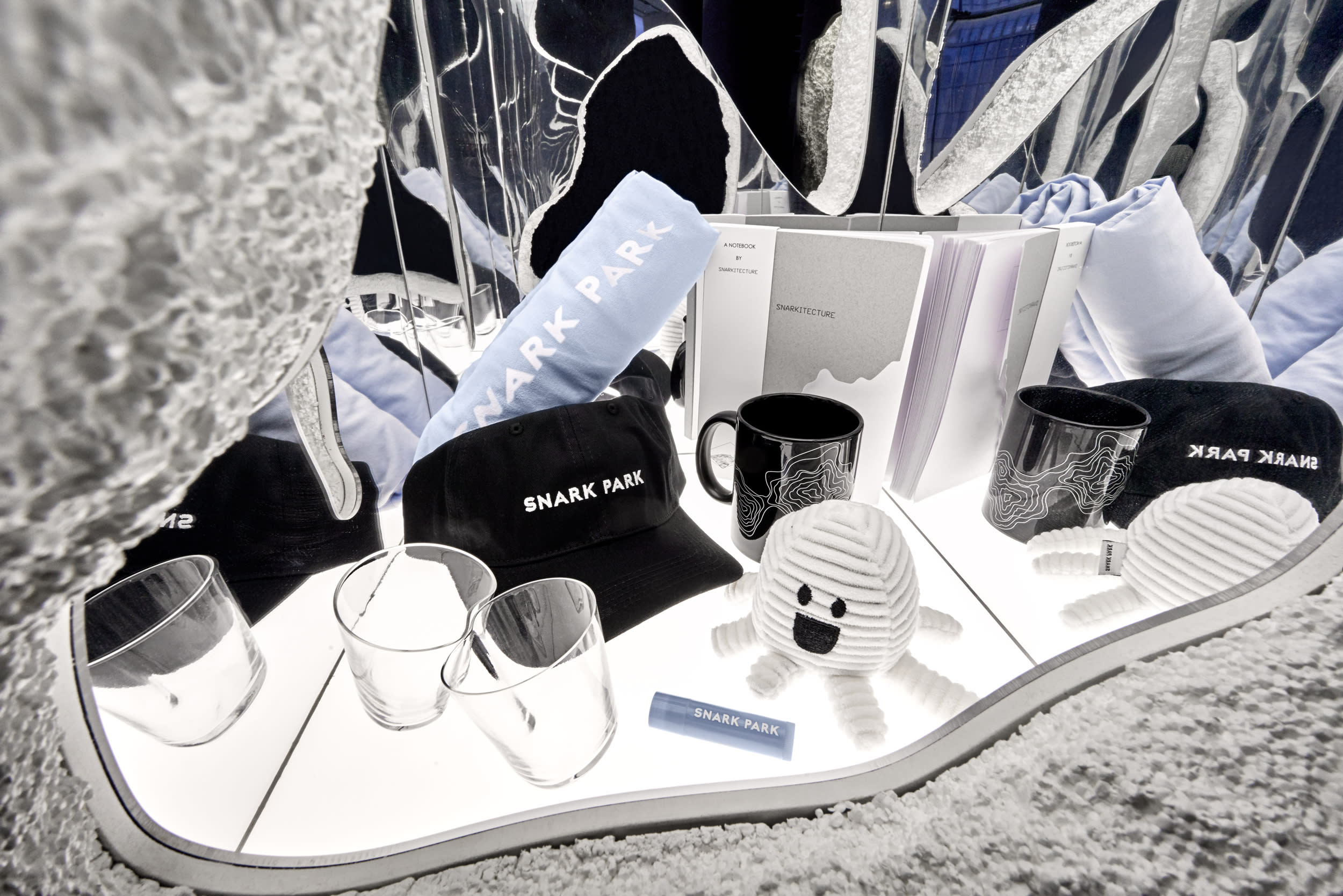
Arsham: When we first started talking about the project, we knew we wanted to have a shop—like, a museum shop, which you know in a lot of the other locations that we’ve done, we haven’t been able to control what’s been in there. We started talking about this partnership with Ronnie and having him help us curate the selection. Kith Treats is in the entrance, so we’ll carry all of the typical Kith Treats merch, as well as the Snark Park merch, and then a very limited selection of Snarkitecture designed objects, which are exclusively available here.
What do you hope that people will take away from this experience?
Mustonen: Come back to the next one.
Arsham: I hope that on a certain level that it’s something that’s fun. I think that certainly, its location within Hudson Yards and within New York in general, that Snark Park can be a bit of an attraction or diversion. It’s very different than a lot of the other things that are not only in this building, but in this neighborhood and in the city. For us, it’s a totally new model. I hope that people in general have a meaningful and memorable experience here, but at the end of the day, there’s also something fun about it.
Porto: I think generally we always want people to have a good experience in what we do, but also really reconsider architecture and space once they leave, and that what we’re playing with and trying to make playful can happen everywhere else. That’s the hope—that people start to explore more outside of the Snarkitecture project.


